

Zaku Impression
作インプレッション
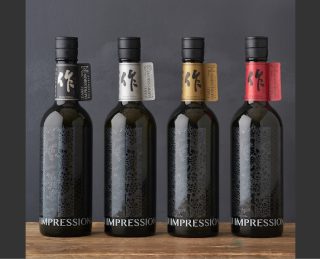
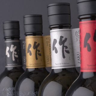
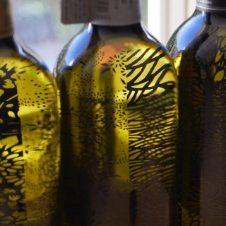
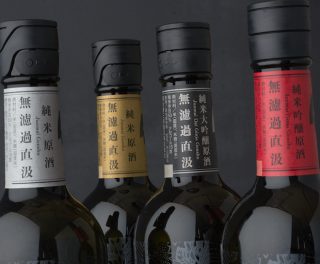
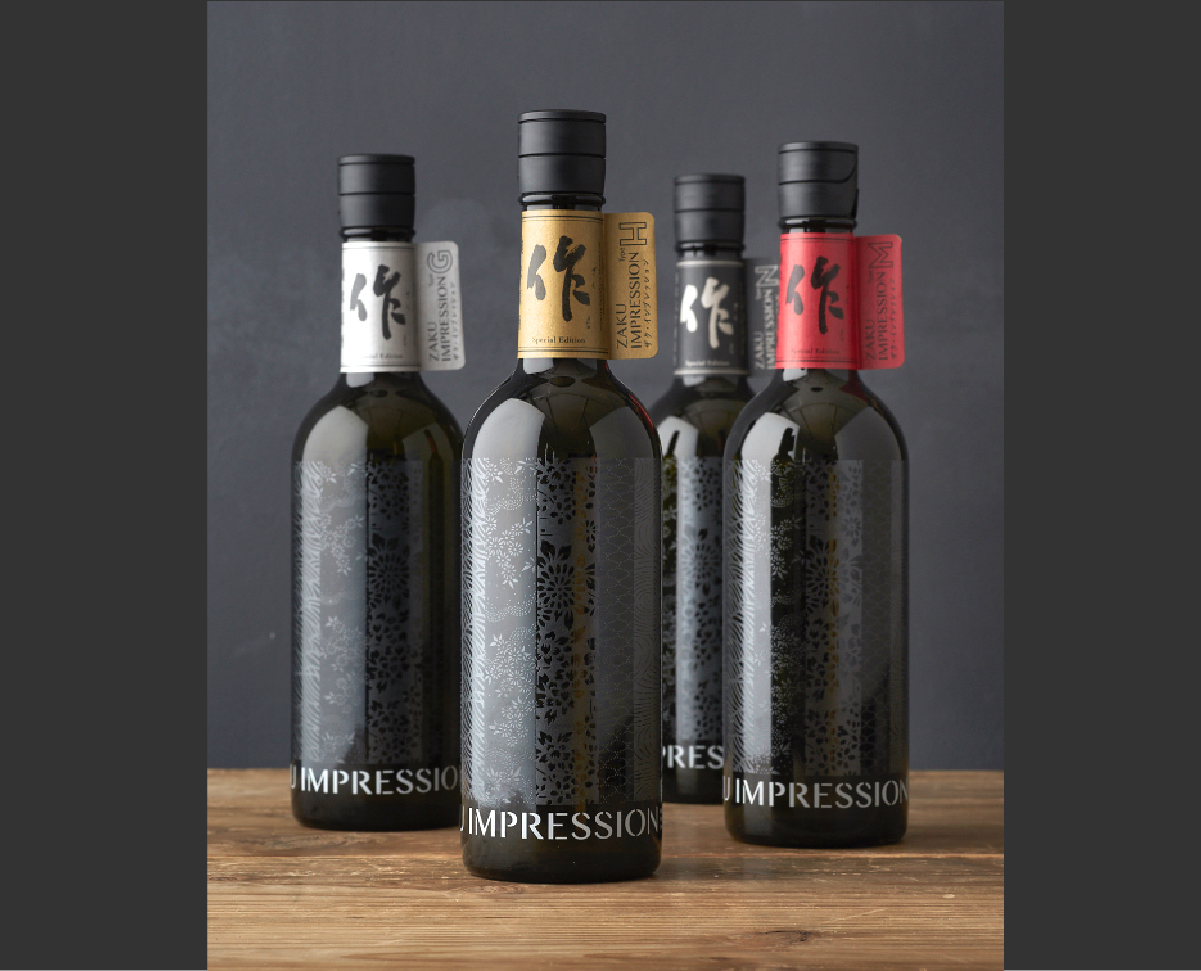
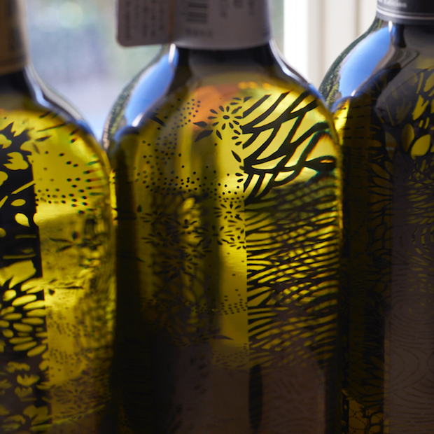
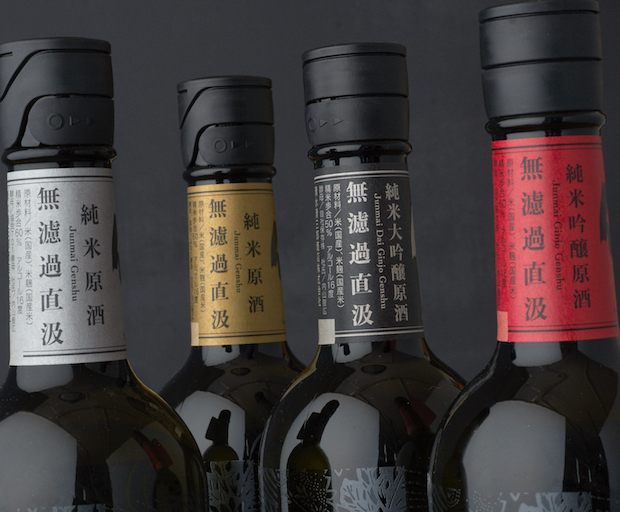
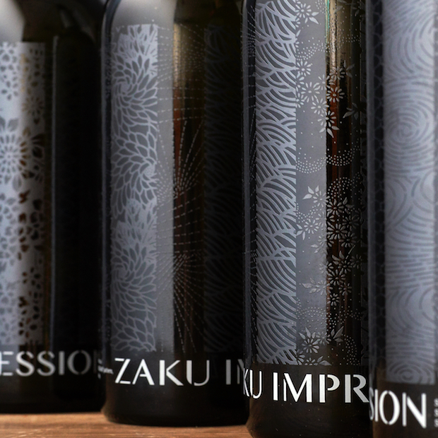
このお酒は、 作りたてのフレッシュな味わいにどれだけ近づけられるかを試行錯誤し、 発酵したてのガス感を残すように作られたお酒。 従来とは異なる手法で製造するため手間がかかり、 多くを作ることが困難であることから、 販売時期や数量に限りのある限定品として扱われます。 デザインにおいても、 限定品としての特別感をアピール。 蔵元のある三重県鈴鹿には素晴らしい伊勢型紙という伝統産業があります。 酒造りの伝統と共にこの型紙の紋様を現代のデザインに落とし込み活用することで、 この地域の伝統産業を継承することにも繋がるという思いも込め、 瓶にはさまざまな伊勢型紙の紋様を使いました。 さらに印象的なボトルになるようボトルプリントを採用し、 必要な情報はネックに巻いたラベルに集約しました。 結果、 大変個性的なデザインとなりました。
日本の「グッドデザイン賞2018」、ドイツの「レッドドットデザイン賞 2018コミュニケーション部門」を受賞させて頂きました。
日本の「グッドデザイン賞2018」、ドイツの「レッドドットデザイン賞 2018コミュニケーション部門」を受賞させて頂きました。
This sake was created through trial and error to come as close as possible to the fresh taste of newly brewed sake, while retaining the effervescence from the initial fermentation. Because it is produced using methods different from traditional techniques, it requires more effort and is difficult to produce in large quantities. Therefore, it is treated as a limited edition product, with restrictions on sales periods and quantities.
The design also emphasizes the special nature of this limited edition. Suzuka, Mie Prefecture, where the brewery is located, is known for the traditional industry of Ise-katagami stencils. By incorporating the patterns of Ise-katagami into the modern design, we aimed to carry on the tradition of this regional industry alongside the tradition of sake brewing. To create a more striking bottle, we used bottle printing, with all necessary information consolidated on a label wrapped around the neck. The result is a highly unique design.
We were honored to receive the "Good Design Award 2018" in Japan and the "Red Dot Design Award 2018" in the Communication Design category in Germany.
We were honored to receive the "Good Design Award 2018" in Japan and the "Red Dot Design Award 2018" in the Communication Design category in Germany.