
2021 ZAKU Renewal
作リニューアル
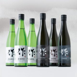
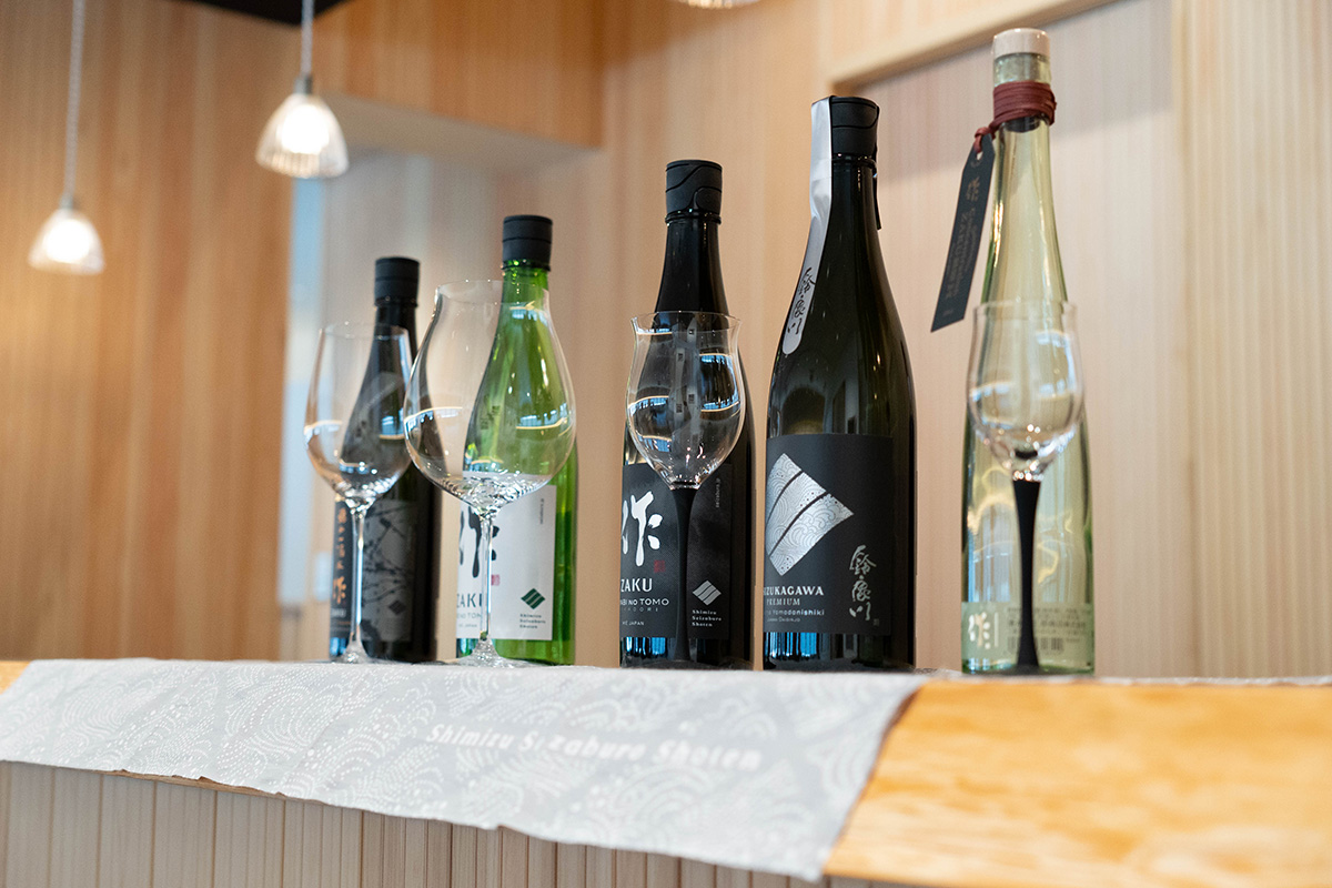
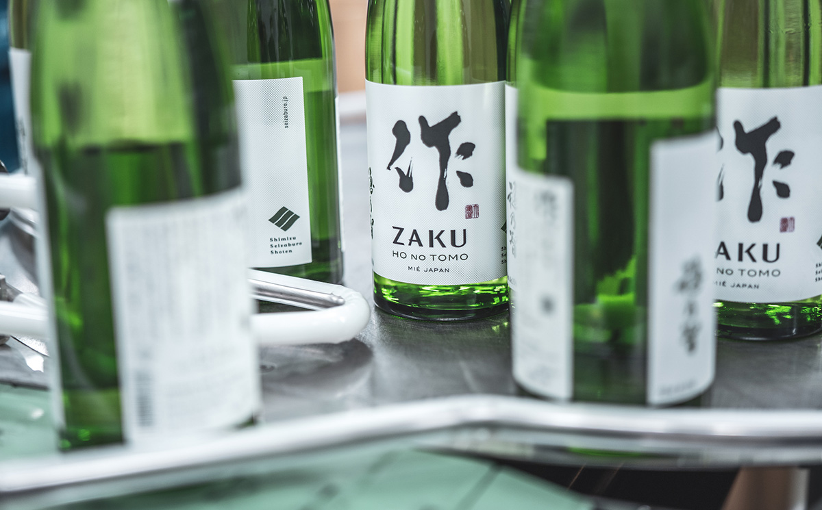
清水清三郎商店の主力ブランド「作(ざく)」。 この「作」は、徹底的に妥協しないこだわりの酒造りが特徴で、取り扱いは日本酒専門店に限られています。
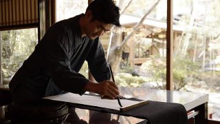
今回のリニューアルは、150周年プロジェクトを進めてきた清水清三郎商店の中核を成す企画であり、ブランド創設以来使用してきた「作」のロゴから見直しました。 新しい筆字は「日本書鏡院」の長谷川耕史先生にお願いし、若々しく力強い書体に生まれ変わりました。 清水清三郎商店ではこれからますます輸出に力を入れていくとの方針から、アルファベットと併記し、海外でもブランドがしっかりと認知できるようにデザインしています。
今回のリニューアルは、150周年プロジェクトを進めてきた清水清三郎商店の中核を成す企画であり、ブランド創設以来使用してきた「作」のロゴから見直しました。 新しい筆字は「日本書鏡院」の長谷川耕史先生にお願いし、若々しく力強い書体に生まれ変わりました。 清水清三郎商店ではこれからますます輸出に力を入れていくとの方針から、アルファベットと併記し、海外でもブランドがしっかりと認知できるようにデザインしています。
himizu Seizaburo Shoten's flagship brand, "Zaku," is known for its uncompromising dedication to quality sake brewing, available exclusively at specialty sake stores.
This redesign is a central part of Shimizu Seizaburo Shoten's 150th anniversary project. We revisited the logo of "Zaku," which has been in use since the brand's inception. The new calligraphy was done by Koji Hasegawa from the Nihon Shokyo-in, giving it a youthful and powerful appearance. As Shimizu Seizaburo Shoten is increasingly focusing on exports, the new design includes both Japanese and English to ensure the brand is well recognized internationally.
This redesign is a central part of Shimizu Seizaburo Shoten's 150th anniversary project. We revisited the logo of "Zaku," which has been in use since the brand's inception. The new calligraphy was done by Koji Hasegawa from the Nihon Shokyo-in, giving it a youthful and powerful appearance. As Shimizu Seizaburo Shoten is increasingly focusing on exports, the new design includes both Japanese and English to ensure the brand is well recognized internationally.