
Herb Meister Center VI
ハーブマイスターセンターVI
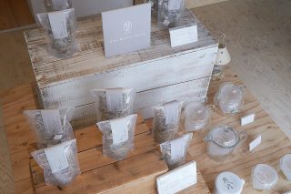
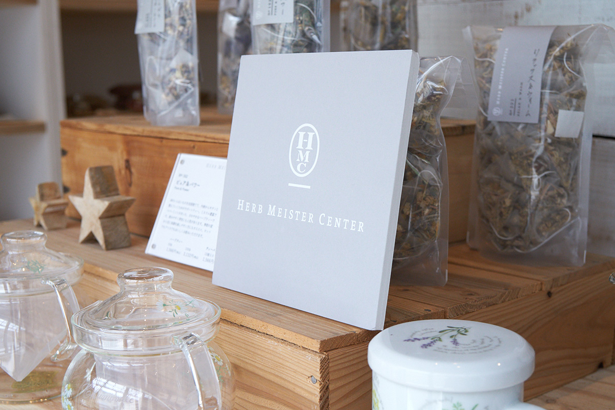
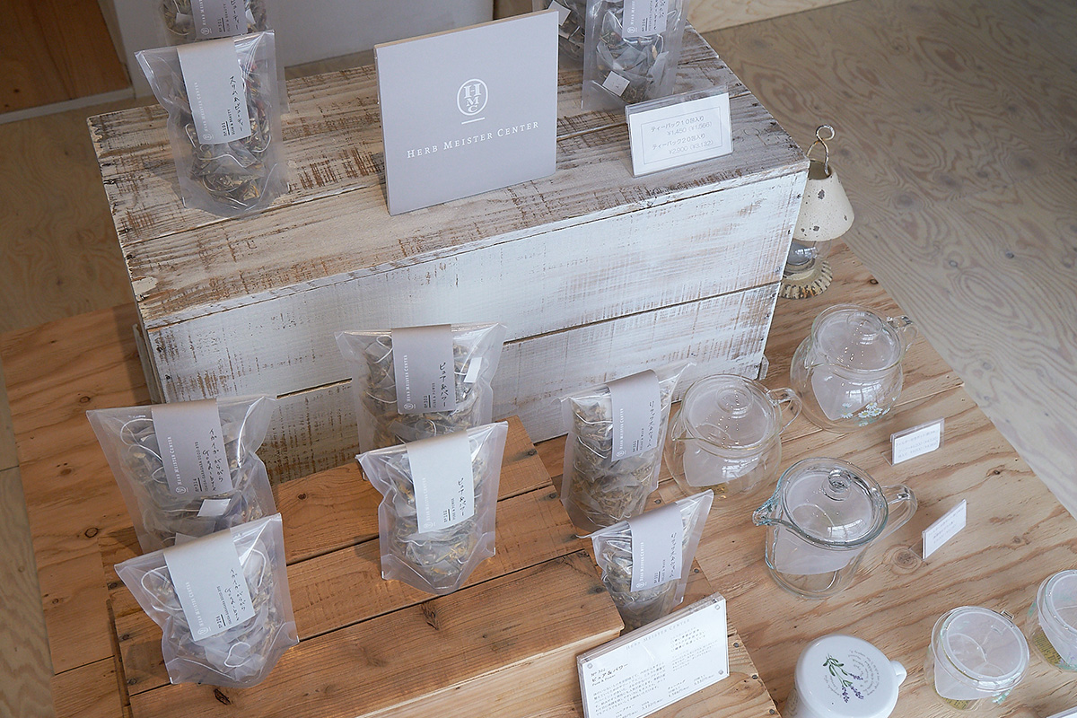
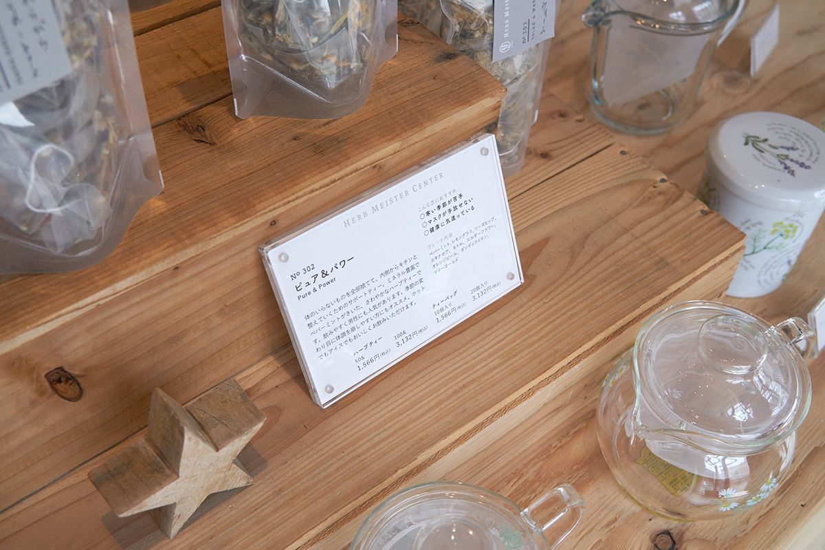
ハーブ専門店「ハーブマイスターセンター」のロゴ及びパッケージのリニューアルデザイン。 ハーブには体全体のバランスを整え、体だけでなく心を癒やす効果があります。 その効果は多岐にわたり、古くから薬として利用されてきました。 ハーブマイスターセンターのVI(ヴィジュアル・アイデンティティー)として全体を考えるにあたり、そうした薬用効果や信頼感の伝わるデザインを目指しました。 全体的なカラーはハーブの繊細な色を引き立てるよう、薄いグレーを基本としています。
We redesigned the logo and packaging for the herb specialty store "Herb Meister Center." Herbs have the effect of balancing the entire body and healing not only the body but also the mind. Their benefits are diverse, and they have been used as medicine since ancient times.
In considering the overall visual identity (VI) of the Herb Meister Center, we aimed for a design that conveys these medicinal effects and a sense of trust. The overall color scheme is based on light gray to enhance the delicate colors of the herbs.